Python Line Graph
A line graph is a simple graph that shows the results in the form of lines. To create a line graph, we need x and y coordinates. For example,
plt.plot(x, y, 'colorname')
Here, the plot() function creates the line graph. x and y represent lists of coordinates for X- and Y-axes. 'colorname' indicates the color name to be used for the line.
Python Line Graph Example
A program to create a line graph to show the profits of a company in various years.
Copied
#to display profits of a company year-wise
import matplotlib.pyplot as plt
years = ['2012', '2013', '2014', '2015', '2016', '2017']
profits = [9, 10, 10.5, 8.8, 10.9, 9.75]
#create the line graph
plt.plot(years, profits, 'blue')
#set title and labels
plt.title('XYZ COMPANY')
plt.xlabel('Years')
plt.ylabel('Profits in Million Rs')
#show the line chart
plt.show()
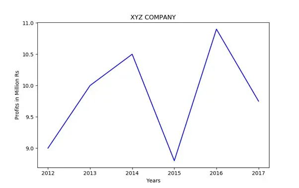
From the above output, we can understand that the profits of the company are the highest during the year 2016 and the least during the year 2015.